
Reviewing a printed proof
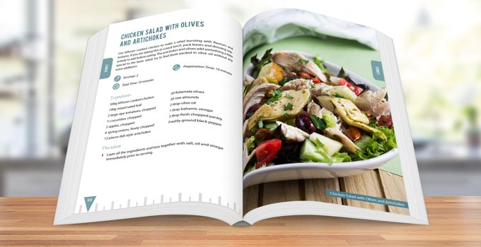
It's here! The very first, hold-it-in-your-hands copy of your book. You should already have a good idea of what you can expect after reviewing your digital proof, but there really is no substitute for the real thing. It's time for you to flick through the pages, appreciate your paper and color choices, look at the quality of the printing and binding, and, yes, inevitably spot those last few edits. You're not quite over the final hurdle yet, but you're nearly, nearly there. Work through our guide to checking your printed proof so you don't miss anything important.
Think like a customer
When you open up your parcel to handle your printed proof for the first time, it's an excellent opportunity to put yourself in the shoes of a customer doing the same. Imagine a reader has ordered a copy of your book, and it's finally here. Can you use your initial reaction to tell you something about what theirs will be? What grabbed your attention first? Does the book look big or small, thick or thin, feel heavy or light? Does the front cover set the right tone? Flip the cover over. Does the back cover convey the right message? Put the book on your shelf and examine the spine. Does it fit next to other books, blend in or stand out? Now flick through the pages. Does the text look properly aligned? Are the margins wide enough? Do the colors and images look good? Note down anything that jumps out at you, or that feels clunky or out of place. If you get the chance to, ask friends or family to do the same.
Examine product quality
Your book is a manufactured product, just like a notebook, an instruction manual, or a diary. Now's the time for you to be completely objective and honest with yourself if you can. Does this book look like a well-made product? Look at the cover, is it properly bound? Are you happy with the feel of the matte or gloss finish? Does the spine text look like it has been properly placed and aligned? Is there any shipping damage, bends or scratches? Now look at the interior. Has your printer printed the pages well? Have they bound them straight? What do you think of the paper thickness? What about the color? How do the pages feel as you turn them? Do any of the images show through to the other side of the paper? Take notes on anything you notice, then think carefully, it's important to try and differentiate between what's a manufacturing fault and what's a production choice. The first is down to your printer to resolve, the second may need you to do some rethinking. If, in hindsight, you think some of the choices you made haven't worked well, speak to your designer or printer and ask for advice.
Keep print limitations in mind
While it's good to analyze the production of your book, and you should, try not to become obsessive about it. You've probably bought plenty of books in the past, and we doubt you noticed every single imperfection. So keep reminding yourself: no reader is ever going to examine your book with the same intensity that you are now. Now's also the time to take your chosen printing method into consideration. Print-on-demand means a copy of your book only gets printed when someone orders it, and because every copy is printed individually, they'll all be a little different. Factory conditions, inks, temperatures and papers vary slightly from day to day and between printing locations. For example, the text might shift on a page by up to 1/16 of an inch and your printer would still be within acceptable limits. Make sure these variations are going to be satisfactory to you now, so you're not disappointed or surprised later.
Photograph anything you're unsure about
As much as your designer may be keen to help you understand, fix or change how certain aspects of your design appear in print, it is often very difficult for them to guess exactly what you can see. The best way to show us is to use a camera, the one on your phone is fine, and take a few clear photographs. We can then advise you whether the issue is down to print quality or whether a design adjustment could help make things look better on paper. It's also important to photograph the barcode on the back cover so we can identify the specific print batch if needed.
Read the book carefully
Read your book as if you were reading it for the first time, as much of it as you possibly can. Don't be tempted to skim-read. It's disconcerting, but once your content is all laid out on paper pages, little errors and typos seem to jump off the page. You'll be amazed at the things you pick up in print that you didn't spot even when reviewing your digital files on a screen, trust us, it happens every time. Grab a pencil and mark off any issues on the pages as you go. Even if you notice lots of errors, don't despair too much, it's better to find them now than leave the job to your readers. Even large publishers who employ proofreaders to check books multiple times don't catch absolutely everything. Consider every error you spot now a victory, not a failure. Once you've finished marking typos with a pencil, go back to your digital proof, open your PDF book file and add the changes in as comments, then pass the file back to your designer so they can make the necessary changes.
Decide whether another proof is needed
If you find you want to make a lot of changes to your book, you'll need to order another proof copy and go through this cycle again. This is especially important if you're printing a big run of books. You may even need two or three printed proof stages to get it absolutely right. We know it's a pain, but you won't regret it, we promise. You need to be completely confident that your digital proof file and your printing choices are going to come together seamlessly every time a copy of your book leaves the printer.
Getting your printed proof is an exciting and vital stage in your book's life and definitely worthy of some celebration. Just make sure you see it as an opportunity for more progress, not a finishing line. A little extra time and patience are always a good investment. A printed proof confirms the book formatting looks right on real paper, not just on screen.