
Reviewing a digital proof
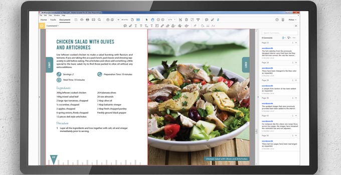
Exciting times, your digital proofs are ready! This is your very first chance to get a sense of what your book will look like. So let's take some time to understand a bit more about what your digital proof is and what it's for. We'll talk you through how you should view it, and what you should look for when reviewing your files. As we go, we'll give you some valuable tips on how best to note any changes, and show you why a digital proof is only one stage of a longer process.
Open the file with the right software
Once your book design is complete, you'll receive your first proof files to review digitally. This gives you the opportunity to closely examine each page of your book on a computer screen and check it carefully before anything gets printed. Your designer will send you your book's interior via a single PDF file, with the cover layout available as a separate PDF file. The best software for you to review these PDFs on is Adobe Reader, it's free, easy to use, and displays files reliably, which at this point is very, very important. There are lots of other PDF viewers out there, but Adobe Reader is definitely the recommended choice, after all, Adobe invented the PDF in the first place!
Use a large screen
To review your files well, you need to be sitting at the biggest, clearest screen you have, at home or in your office. Whatever you do, do not attempt to review your book on a small tablet or smartphone. We know it would probably be more convenient, but those small screens won't render your text reliably, you won't be able to see your pages in enough detail to appreciate them or check them properly. For the book interior, you should ideally look at the file using the view "two-up with a cover page." Your designer may already have set this as a default for you. This gives the closest impression of how your pages will look in your printed book, showing even numbered pages on the left and odd numbers on the right, so you can simply scroll through to review them. You may find that your designer includes a watermark, like the words "REVIEW COPY." This might be because something is missing from the file, or because the file does not yet include final print marks, or even because they haven't yet received payment for the work.
Review in passes
The best way to check a book is in passes, looking for specific things each time. Maybe the first time you could review the structure and headings, next time read the text for errors, then check the consistency of the design. This is a much more thorough and focused way of working than trying to look at every aspect of every page all at the same time. Here are three passes you should include:
Check for typos and text issues
We know you proofread before you sent your manuscript to your designer, but yes, it's time to check again. With the pages laid out nicely and the text all beautifully typeset, it is very common to start noticing typos and inconsistencies you couldn't spot in your original manuscript. Don't panic, though: this is exactly what your proof is for.
Check for interpretation and layout choices
Your designer will have used your manuscript and headings, along with any instructions, as a guide to understanding the breakdown of your book. It's entirely possible, however, that you will both interpret things in different ways. This is particularly the case with non-fiction, perhaps your designer saw some boxed text as an important callout when you meant the box to show it was a minor footnote. Again, don't worry. Just let them know.
Look out for genuine mistakes
Rest assured that your designer would have worked through your material methodically and carefully. However, while designing your book, every paragraph will have been touched and styled. Your designer will have had to remove extra spaces and tabs, enter running headers and change casings, recreate tables and diagrams, the list is endless. You are working with a human, albeit a dedicated one, and so it's impossible to guarantee there will never be a mistake. Now's your chance to check nothing has slipped through.
Mark changes clearly using PDF comments
The best way for you to note any issues or errors in your proof is via PDF comments. These brilliant little virtual post-its let you pinpoint the exact position of an issue, along with a few words to explain what changes you require. PDF comments make problems nice and clear to your designer so they can easily find and make the required change in your book source files. The alternative is to try to explain in words where the issue is, but this can be ambiguous. For example, if you wrote, "Page 45, paragraph two, 'the' should be 'they'", there could easily be two instances of 'the' to choose from. Highlighting the exact place with the comment function saves any confusion.
Understand bleed and crop marks
Your designer will have carefully prepared your PDF file to the exact specifications of your chosen printer. This means you may see printer marks, including crop marks and bleed. It's very difficult for a printer to print right up to the edge of a piece of paper, instead they print on a slightly bigger area than necessary and trim the edges to the right size. This extra area of the page is called the "bleed." Some printers require bleed on all sides of the page, others on the outer edges, and some ask for bigger bleed than others, it all depends on the printer. If anything looks odd, just ask your designer, and they can clarify.
Understand the limits of a digital proof
A digital proof can't replicate the look and feel of real paper. It won't show you the color of the paper, its texture, or its finish. It also won't demonstrate how it takes the ink, or reveal any potential "show-through" from the page on the other side. Your digital PDF won't be able to match the colors shown in your printed book perfectly either, computer monitors display colors in RGB, while commercial printers use CMYK ink. This color conversion process can lead to some shift and darkening in colors, very bright shades like sky blue may appear more muted on paper than you saw on screen. For all these reasons, you should never think of your digital proof as the finished product, waiting for a printed proof is still absolutely essential.
Hopefully, once your digital proof arrives, you'll know exactly what to do with it. You'll better understand how to check it and what to look for, and the best way to give feedback to your designer. And if you only remember one thing, remember this: don't rush! Slowly and methodically working your way through your proof is always worth your time and patience. Get this bit right, and you're one step closer to having a perfect book in your hands. The digital proof is your chance to check the book formatting before anything goes to print.