
Choosing color or grayscale
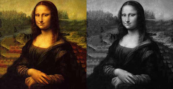
The decision on color in a book typically comes down to cost. Color printing just costs more than grayscale, whether that's lower quality standard color on thinner paper, or thick premium coated stock with glossy inks. For a novel you don't need it, for a photography book there's no question, but for the others that sit in the middle, it's a balance.
Take a look at these two images. If I asked you which one you thought was better, which one would you choose? My guess is that you'd go for the color image, and who can blame you. There is something about the energy of color that is hard to resist.
Now, what if you wanted to print and sell a book that used this image? You want to make a good profit, after all, and color printing is costly. Hmm. Using color now becomes a matter of practical priorities, doesn't it? It's not just about taste, and that means some tricky decisions.
A book entitled "Famous Paintings" is going to rely on masterpieces displayed in their full color glory. But what about a book called "The Da Vinci Biography"? Would color still be better?
We know that with your book's success on the line, making the right decisions is a stressful business. In this guide to color and grayscale printing, we'll help you better understand the choices ahead of you. Hopefully, the right decision will become much more obvious, and we'll leave you feeling more confident.
The difference between color and grayscale printing
Before we get stuck in, it will help to get to know the printing process a little better. Grayscale printing is what we think of as black and white printing. When we print in grayscale, what we're essentially doing is applying little black dots to white paper. More dots in a space appear dark gray, fewer dots appear light gray. Ms. Lisa on the right up there is made up of thousands of these little black dots. There are more dots in her dark hair and robe than in her lighter skin and the sky.
Color printing uses dots too, but in a different way. When someone says that they're printing in color, most of the time they mean that they're printing with four specific colors. These four colors, Cyan, Magenta, Yellow, and BlacK, are what's called CMYK color, or "process color." Commercial book printers use this process. By using dots of these colors mixed together, printers can quickly produce the vibrant shades needed for full color pictures.
Consider popular choices
The type of book you're creating will often give you some clues as to whether color or grayscale is the way to go. Novels always favor grayscale. Readers of novels are put off by a high price tag, so it's extra important to keep costs as low as possible.
Non fiction is more subjective, making the author's decision that bit harder. Non fiction books can be grayscale, 2 color, full color, or grayscale with a few colored inserts. It all comes down to whether the book would benefit from some added interest.
A reference textbook called "Learning to Speak French," for example, might help engage readers by using color illustrations. "Advanced C++ Programming," on the other hand, is unlikely to gain much from full color images. Using 2 color printing could add a little variety and help highlight the most important points. Workbooks designed to be filled in by students are likely to stick to grayscale and use cheaper uncoated paper. Ask yourself: what will readers use your book for?
Coffee table books are almost always full color. Readers buy these books specifically to pour over glossy pages full of high quality photographs or artwork. The only exception to this would be a book of black and white photography where color isn't necessary.
Children's books use bright colors to help draw their young readers' attention. Older readers may be happy with grayscale illustrations, but for younger readers, it's a case of the brighter and more colorful the better.
Look at other books
As the author, you're probably very aware of other bestsellers in your genre. If you can, visit a local bookshop or library and physically leaf through the pages. If not, look them up on Amazon and review what you can via the "look inside" feature.
For those printed in color, what do you think color adds to the book? It probably looks more attractive, but try to dig a little deeper than that. Could the same message have been delivered without color? What would it have lost? Do you think a lower price on the cover without color inside would have meant more readers or fewer? Would it have meant higher or lower sales figures?
Know what your printer offers
Most print on demand digital printers provide grayscale or full color printing. However, your printer may not offer every book trim size and binding type for both grayscale and color printing. Make sure you check all your options with your printer before you set your heart on any particular aspect.
Paper choices can vary too, and today's print on demand platforms may offer more than one grade of color printing. Amazon KDP and Ingram, for example, don't necessarily offer the same combinations of color, paper, trim size and binding.
Non print on demand services typically provide much more flexibility. They might offer the option of inserting colored plates as a block between pages of grayscale text. Printing in 2 colors or 3 colors are also typically available options if you're printing a batch of books with a lithographic printer.
With print on demand, the interior will normally use one printing specification throughout. So if only a handful of pages really need color, you can't usually print the rest of the book at the grayscale price and simply drop those color pages in.
Think about production costs
When it comes down to choosing between grayscale or color, the bottom line is likely to be all about cost. Remember, while a grayscale printer uses a single layer of black ink, a color printer uses four layers of colored inks. For this reason, color printing typically relies on thick, coated paper stock. This is needed to prevent the sheer quantity of ink from wrinkling up the paper. It's also necessary to stop the images showing through on the other side. Add it all up, and this means color printing is always more expensive.
Rather than relying on an old rule of thumb, check the manufacturing price for your actual book with your chosen printer. Even without fixing a dollar figure to it, the important point remains the same: color can cost several times more per copy than grayscale, and that difference has to go somewhere in your retail price.
Some print on demand services offer standard color as a lower cost color printing option. Think of a reasonable magazine level of quality. It might work for something like a business book to add color to the odd line drawing or diagram. However, it's unlikely to be suitable for high quality images. Books relying heavily on detailed photographs or artwork are more likely to need premium color.
Another option is to produce two editions. You might, for example, offer a full color hardback alongside a more affordable grayscale paperback, giving readers the choice.
Think about your content
Finally, it's time to think about the words and pictures you plan to use in your book. Weighing up everything we've run through so far, do they really need color? Do you think most your readers will be happy to pay more for the pages to appear glossier and more attractive? Or would they be less likely to buy it when they see the higher price?
If you do decide to go for grayscale, it's important to go back to your manuscript. If you've been busily preparing it all in color, you may need to make some changes. It could be you've color coded diagrams or referred to "the text in red." Will amending this change your readers' understanding? What other consequences might removing colored elements have? This last question can be a tough one to answer, so if you're not sure, ask your book designer for help.
So now you know
Hopefully, you now have a better understanding of what grayscale and color means when it comes to printing your book. I think we'd all agree that books look more striking in color, but they need to make a profit too.
Find out what your printer offers and then ask yourself: what does my book need? Would grayscale printing do justice to everything that makes it special, or would color printing make a crucial difference?
You know your book best, and now that you have our guide too, we're sure you'll make a great decision. If you'd like some help working out what will work best on the page, that's something we can look at as part of our book formatting service.