All about book paper

Paper gives print books their unique character. It may be so subtle, we don’t even give it thought, but with every turn of the page, paper influences what a book feels like in our hands. The feel of it under our fingers. Its weight, its color, and contrast against the ink. Even the sound it makes as we rush to the next chapter.

It is paper that takes the intangible world of words and ideas and fixes them in front of us in physical form. That’s undeniably special, don’t you think?

As an author, you may never have given much consideration to paper. But paper is the thing that is going to help give your book its life.

If you’re using a print on demand (POD) service, you may be offered fairly limited options when it comes to choosing your paper. But for those of you choosing between a wider range of paper samples, this article may help you decide.

Color

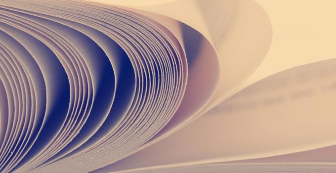
Your book’s paper can be any color you like, as long as that color is white.

Colored paper in books is almost unheard of, but that doesn’t mean there isn’t room for plenty of variation. One glimpse at a paint color chart is enough to remind us just how many shades lie between cream and bright blue-white. Book paper comes in all these shades.

A crisp blue-white paper communicates a no-nonsense, technical feel. It is perfect for images, illustrations, small details and reproducing color faithfully on a page. Some readers also argue that the contrast between black ink and bright white paper is better for their eyesight, and easier to focus on at a quick glance.

Printers may increase paper whiteness by bleaching the pulp or  adding fluorescent agents. Unfortunately these agents can also effect color tones and fade inks so depending on your book, you  may want to check if they are being used.

Many consider off-white and cream tones to be easiest on the eye, especially when reading for long stretches at a time. These tones offer naturally reduced glare and softer contrasts compared with pure white paper. They also have a slightly warmer, friendlier quality, and because of this, they’re often the go-to choice for fiction.

Opacity

Another aspect that’s well worth considering before you commit to a print run is the paper opacity.

Opacity is the amount of light that can pass through a single sheet of paper. Paper with a maximum 100% opacity won’t allow any light through at all, but we’d generally consider anything over 90% opacity to be fine. This means there will be no noticeable show-through of text and images from the other side of the paper.

Now opacity may be less of an issue for something like a novel where you’ll print lines of text back to back, but for an illustrated book, using a high opacity paper is essential. Text and images muddling on the page because of print on the other side not only interferes with the reading experience, it also makes a book feel poor quality. All this becomes even more important when printing images in color, as the paper must withstand multiple layers of ink.

Opacity is naturally influenced by the paper thickness but can be even more so by its coating and finish.

Thickness

The thickness of paper, also known as caliper, is determined by its weight and how much you press it during the manufacturing process. Heavily-pressed paper is thinner, smoother, and floppier. Lightly-pressed paper is thicker, rougher, and stiffer. Think rolling dough to make cookies.

The thickness of the paper has a big effect on how the book feels. Very thin, floppy paper can feel cheap and a little greasy under your fingers, but thick paper, on the other hand, can be difficult and awkward to turn.

We measure paper thickness in microns or points. For thicker paper and card stock, you’ll also sometimes see measurements referred to in thousandths of an inch. Then the book industry, tends to focus more on the overall thickness of the printed book. This is known as pages per inch (PPI).

If you need to, you can convert from paper thickness (microns or points) to book thickness by doing some simple math. Here’s an example.

Let’s say a book has 500 pages. As we go through this, it’s important to remember that a page is one side of a piece of paper, so:

500 pages = 250 leaves (or pieces of paper)
Paper thickness = 86 microns
Book thickness = 250 leaves x 86 microns = 21500 microns

Now, a micron means very little to most of us, so we need to convert to something more familiar. Let’s try inches.
1 micron = 0.00003937 inches
21500 microns x 0.00003937 inches = 0.85 inches
So, your book, without covers, will measure just under an inch thick.

The PPI and final page count together determine the thickness of the book’s spine, which is a critical factor for bookbinding. It’s also essential information for the cover designer who must allow for this width between front and back covers.

Weight

Heavy papers make heavy books. This can be an issue for the person carrying and holding the book, but also for the publisher who needs to pay more to ship and post it.

We tend to express paper weight in pounds (#) per 500 sheets of that paper’s basic sheet size. Unfortunately, ‘basic sheet size’ is not the same for all types of paper, so this makes weight comparisons tricky. As a rough guide, thickly coated papers might be something like 70#, standard papers around 50#, and mass market paperbacks are usually 35#.

A more useful weight measurement might be grams per square meter (gsm), which we sometimes refer to as ‘equivalent weight.’ Looking at gsm can give you a quick indication of different papers’ relative heaviness, from a very light 70gsm to a very heavy 115gsm.

Finish

Finish refers to whether the paper is coated or left uncoated. This alters, amongst other things, a paper’s smoothness.

A smoother surface may feel more exclusive and cool with its sharp line and text reproduction. A rougher surface, on the other hand, can add a more tactile and natural character.

Uncoated paper is a wood-fiber material that feels warm to the touch. But even this uncoated paper comes in a variety of finishes. Antique, eggshell, vellum, smooth, or luster: all will change how your book looks and feels.

Coating a paper will change things still further. Paper manufacturers apply a polymer or clay mix to paper to fill tiny gaps between paper fibers, giving the surface a much smoother finish. The minerals used to coat the paper makes it feel cold to the touch. Coated paper also produces very sharp outlines for both text and images, because the ink can sit on top, rather than soak in.

Depending on the mix, a coated finish can be glossy, satin, or matte coated.  Gloss or enamel coating is shiny. This can make text harder to read but can enhance darker inks and photographs, making them so crisp they almost jump off the page. A matte coating is flatter and duller, but also easier on the eyes as it softens and diffuses light.

Source

It’s also important to consider how manufacturers will produce your paper. Is it new paper or recycled?

New paper requires more energy and produces more CO2 during manufacture than recycled paper. The paper industry has been responsible for large areas of deforestation over the years. If there’s a choice, many people prefer not to contribute to the loss of yet more trees.

Recycled paper treated with chlorine-free bleach has therefore become more widely available in response to environmental concerns and legislation. It’s not yet available for POD, but lithographic printers will often offer this alternative. The downside is that, depending on the percentage of recycled fibers used, the paper product does tend to be a little weaker.

Lifespan

A book’s arch enemies are time and damp. Over time, any acid content in the paper will cause a book to deteriorate, nibbling away at its structure. The American National Standards Institute now strongly recommends acid-free paper after librarians have watched millions of old books disintegrate into dust due to paper acidity.

You’ll find that if your book is expected to have long-term value, your printer will always advise you to choose an acid-free paper. As an extra consideration, if there’s any likelihood of your books becoming exposed to damp, do ask your printer about special surface treatments that can help keep the paper strong in damp conditions.

Putting it all together

All these paper attributes are, of course, interrelated. Change one, and you’ll change another.

Increasing thickness improves opacity but increases the weight. Adding pigment to the finish can make the paper a brighter white. As yet, environmentally friendly paper won’t be long-lasting. And with greater opacity, finish, weight, density, and longevity, you can expect the price to increase.

It can feel confusing and hard to know what to prioritize, but in reality, your options will get whittled down quickly. It’s less of a huge room full of choices, and more a kind of funnel. Once you’ve selected your binding and trim, decided to print in color or grayscale, and chosen whether you are going with a POD service or litho, you’ll probably only have a few different suitable papers and finishes left to choose from.

Armed with your new knowledge from this guide, the final choice should be easier. Just keep thinking about your needs, and the needs of your readers. We’re sure you’ll soon hit upon the perfect balance of personality and practicality of paper for your book. Good luck!